Each user has specific requirements in choosing a bike. Finding a suitable bike is exhausting with a multitude of uncategorized search results in marketplace apps.
An app which is exclusive for bike buyers and sellers. Reduces search time by categorizing bikes based on brand and type.
Before diving into any problem, I believe it’s important to state a problem hypothesis and then test it. Testing a problem hypothesis allows me to develop a deep understanding of the problem, discover implications, and see if it’s worth solving in the first place.
Users feel frustated by the search results for bikes in marketplace apps. Having an exclusive app for bikes with filters to find the exact type of bike solves the problem.
When I developed this hypothesis, I asked myself the following: what kind of data do I need to test this hypothesis? Where can I find quick customer feedback data? Where will I find users to validate my ideas?
I went to the play store reviews of popular marketplace apps to find out if other users recognized this as a problem. This allowed me to get quick data about users without investing time & energy into recruiting users and interviewing users. I audited over 200 reviews and found that many negative reviews mentioned this problem.
In order to reach more people and gather more diverse feedback I conducted a survey. The majority of respondents owned a bike or who will be buying in the future. These are the target users for this app. Respondents were asked to rate the most important factors they consider when buying a used bike, to help prioritise the features that should be implemented in Buycycle app.
Based on my research, I feel confident that there is a recognizable amount of frustration in marketplace app users searching for bikes. If we solve this problem, users will be able to find the right bike quickly without searching through unwanted search results.
Help customers feel confident that they can find the right bike they are looking for.
The solution should be seamless and easy to use.
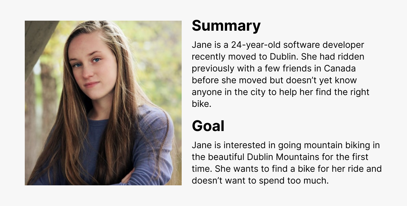
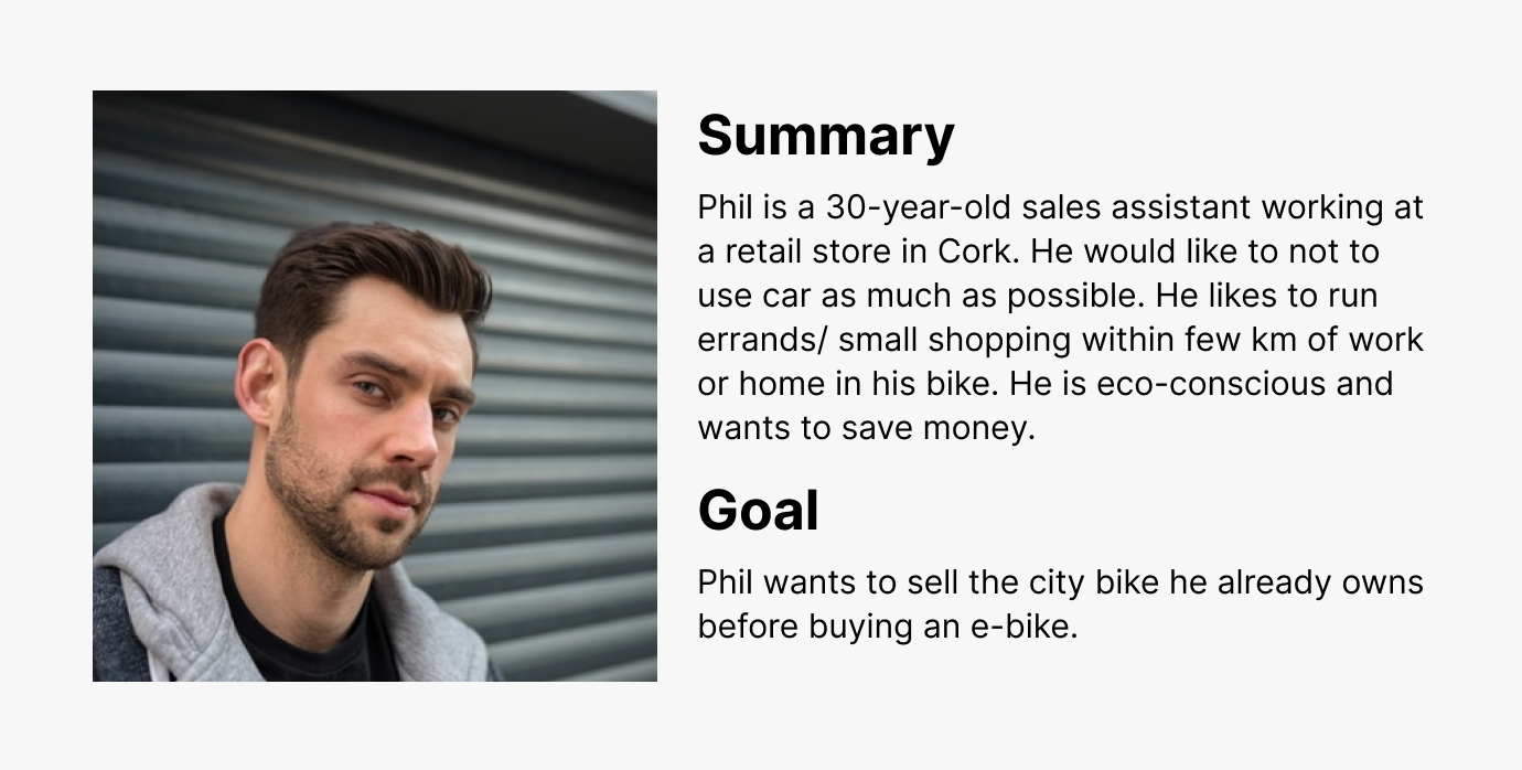
For me, it is important to have a persona because it allows me to bring the target user on the journey of designing a solution. Developing this persona helped me to refer back to the thoughts and feelings of the users.
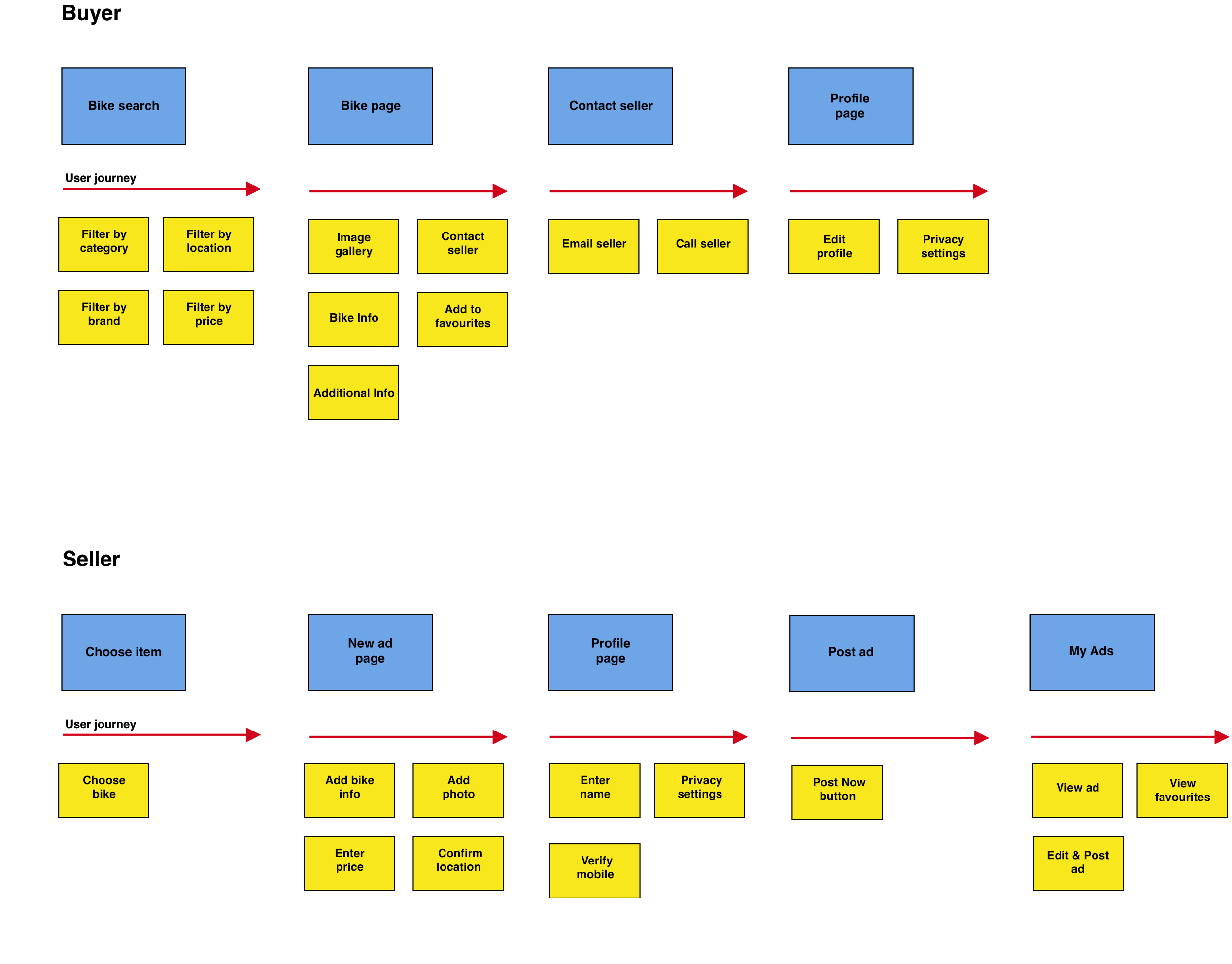
Laying out the user journey map enables me to see the full experience rather than a few pain points. As I build a journey map, I like to focus on potential opportunities to improve the user experience. I based this journey map off a specific use case.
Based on my research, I feel confident that there is a recognizable amount of frustration in marketplace app users searching for bikes. If we solve this problem, users will be able to find the right bike quickly without searching through unwanted search results. I also went through multiple revisions of different "How Might We" questions to help to me have a clear understanding of the problem I was solving.
Anyone can come up with an idea and think to themselves "this idea is great, now let's move on and test it." To get out of that mindset I write down 'Things to consider.' When I break the idea down and question it's value, I can often find small issues that need to be addressed. Here are a few of those 'Things to consider:'
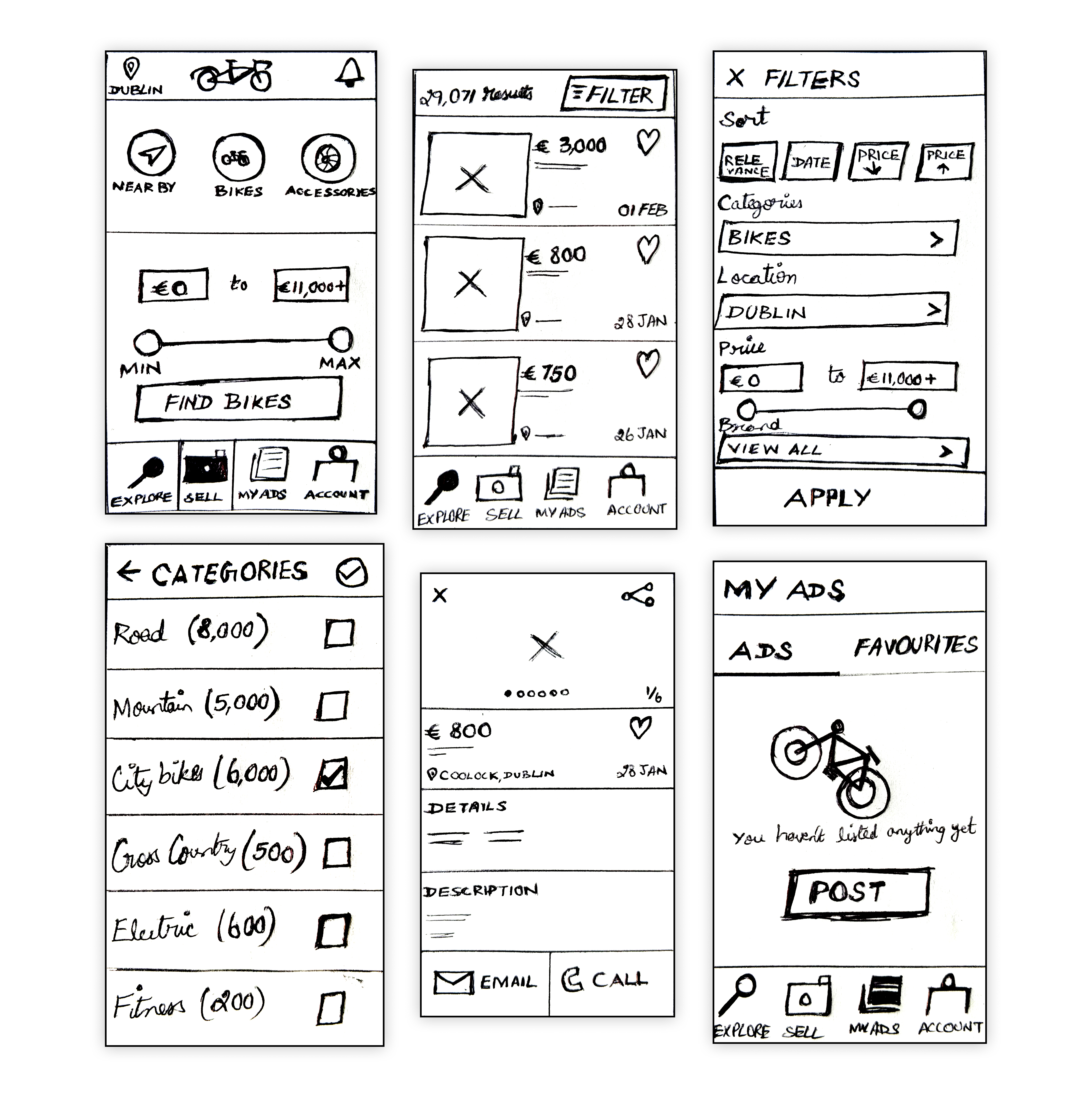
Early ideas for Buycycle were sketched out repeatedly with pen and paper in order to form a general idea of the possible screens and user flows. The lightning-fast nature of these paper sketches (often done repeatedly and to a timer) was great for getting ideas out quickly.
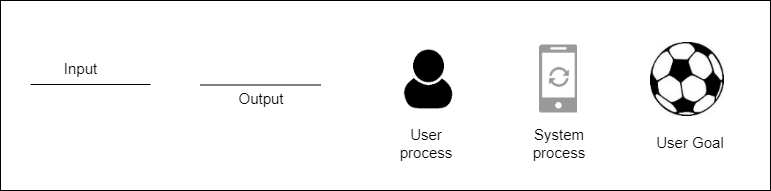
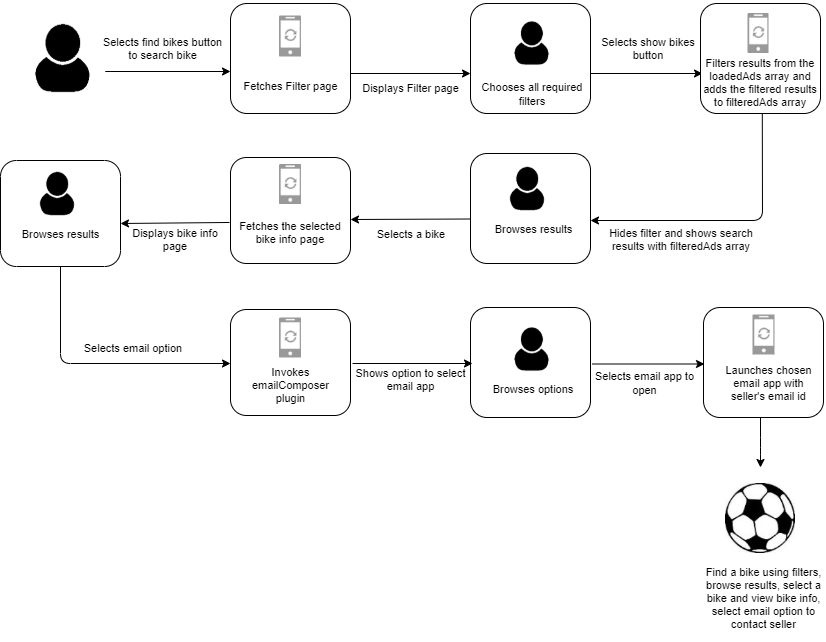
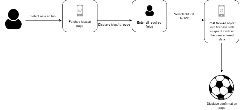
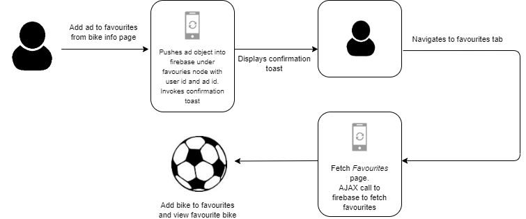
I generated the interaction diagrams to figure out the sequence of interactions that the user is going to perform inside the buycycle app. This helped me to quickly evaluate the efficiency of the process needed to achieve a user goal and help pinpoint the execution of the ideas.
Finding a bike using filters, browsing results, selecting a bike and viewing bike info, selecting email option to contact seller.
Posting a new ad.
Add bike to favourites and view favourited bikes.
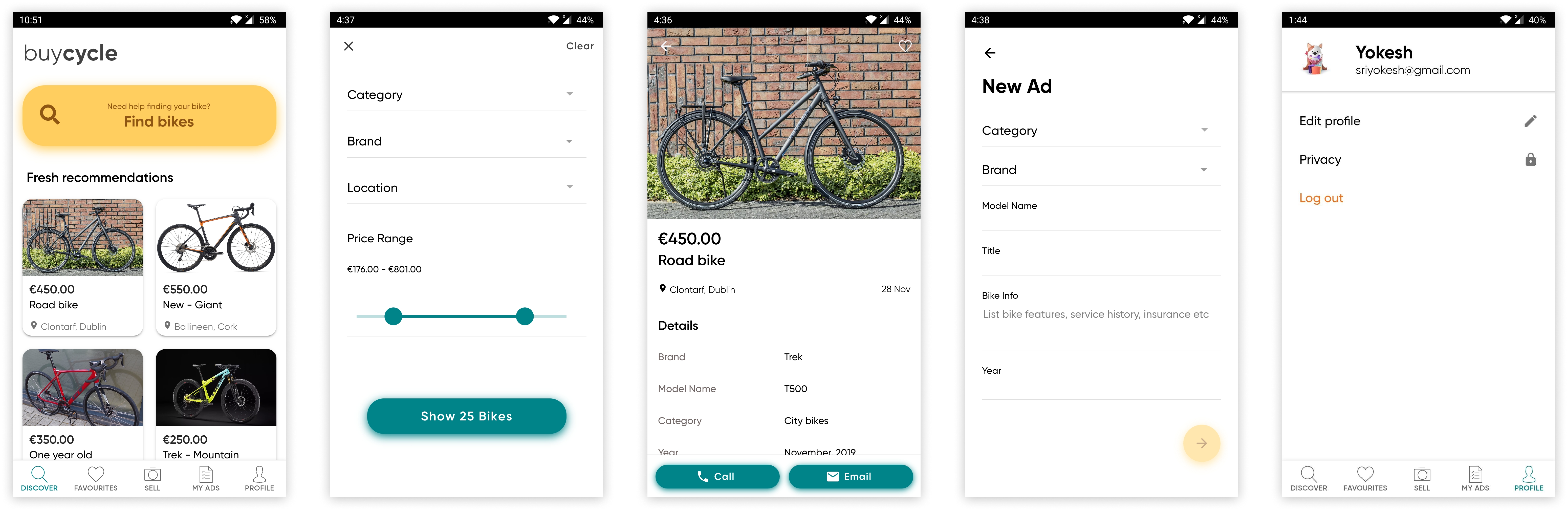
Once I explored different ideas, I wanted to test this idea with users. I did some qualitative testing with a few screens to test some variations. I then mocked up screens in Sketch to build my prototype in InVision. I conducted usability tests with 6 users.
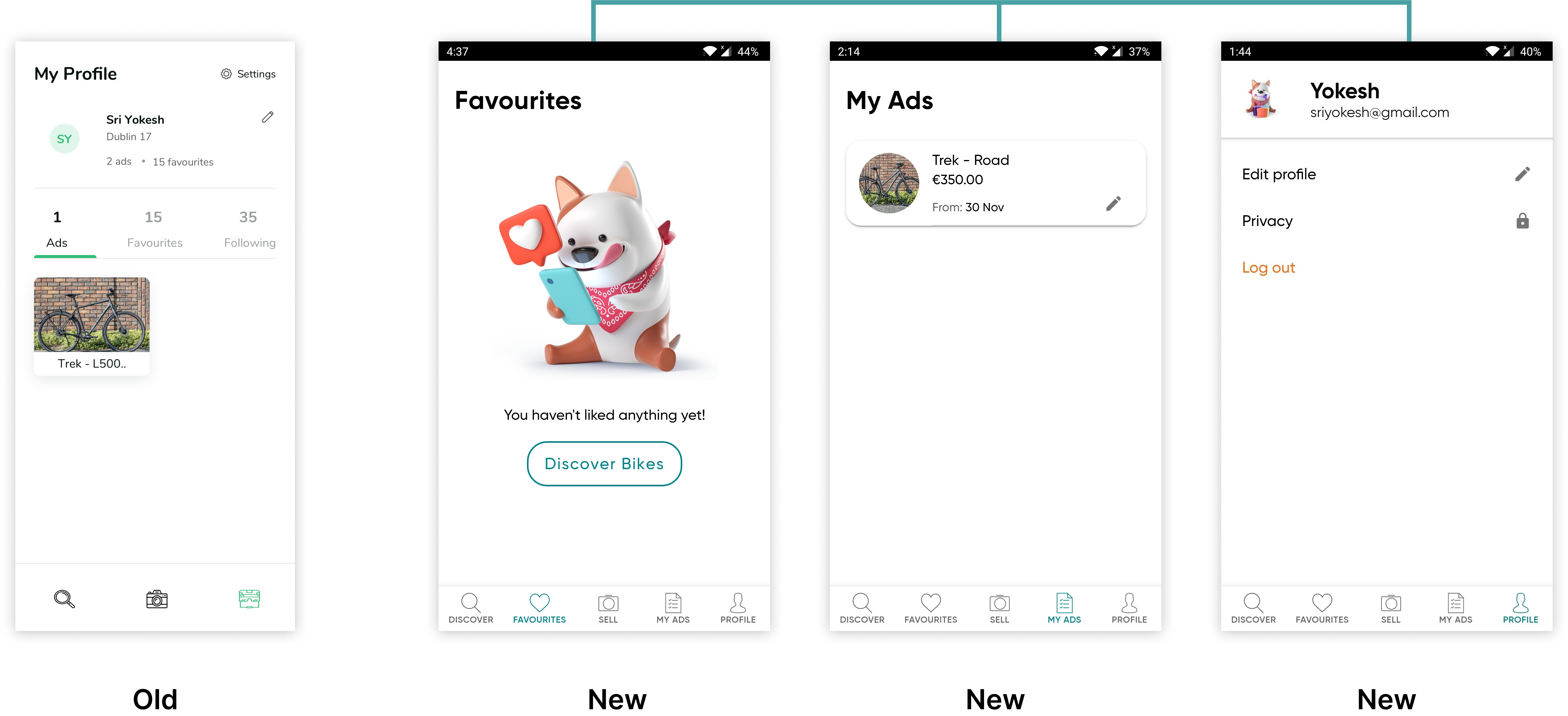
Users were unaware of the favourites and my ads feature available in the profile page.
Splitting out of favourites and my ads functionality from profile page into two separate tabs. Users wanted separate tabs here for clarity and quick access.
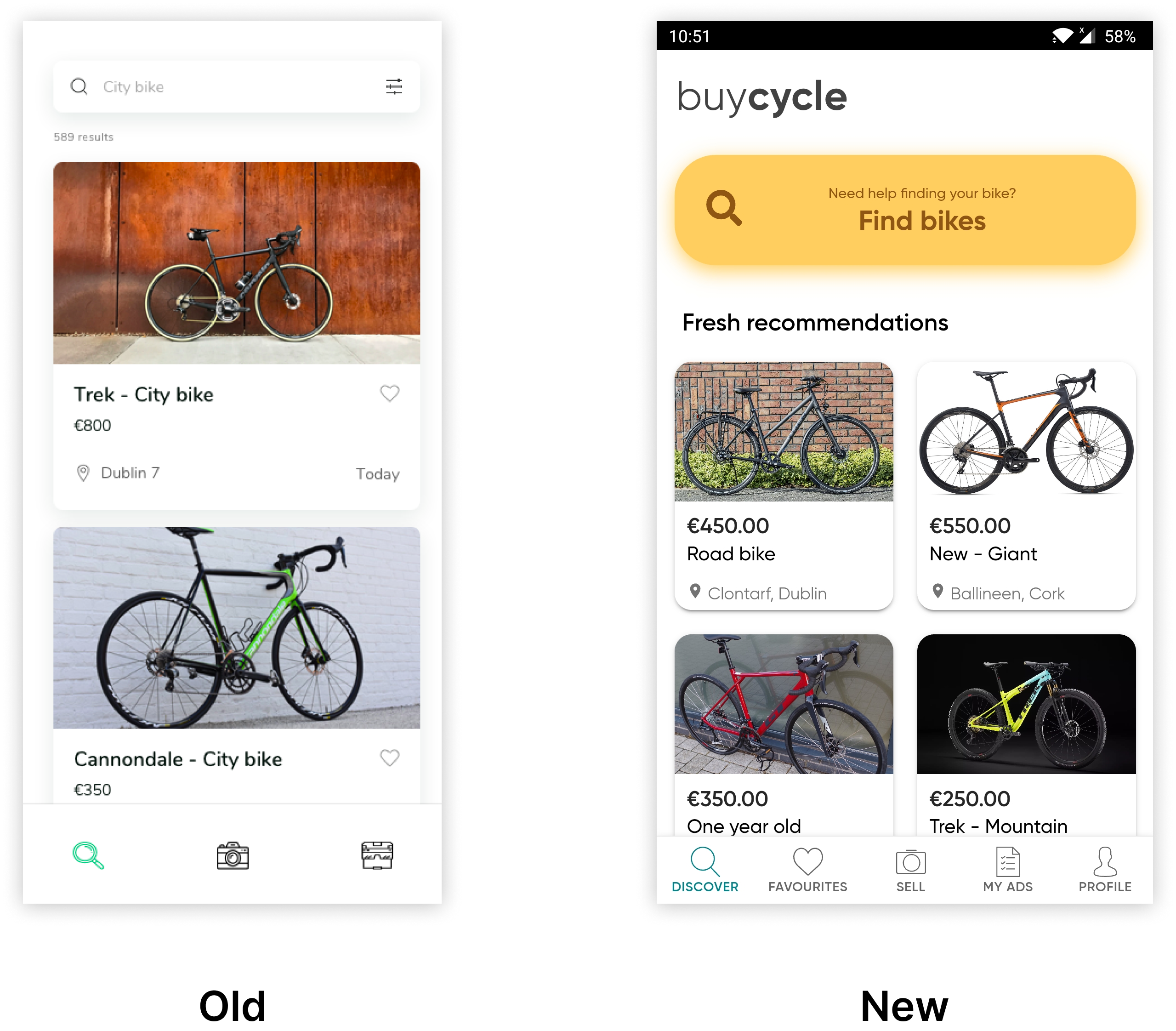
Users were not enjoying the single large card per row and wanted to see more ads per page.
It has been replaced with two cards per row which gave more room to add a bigger search button.
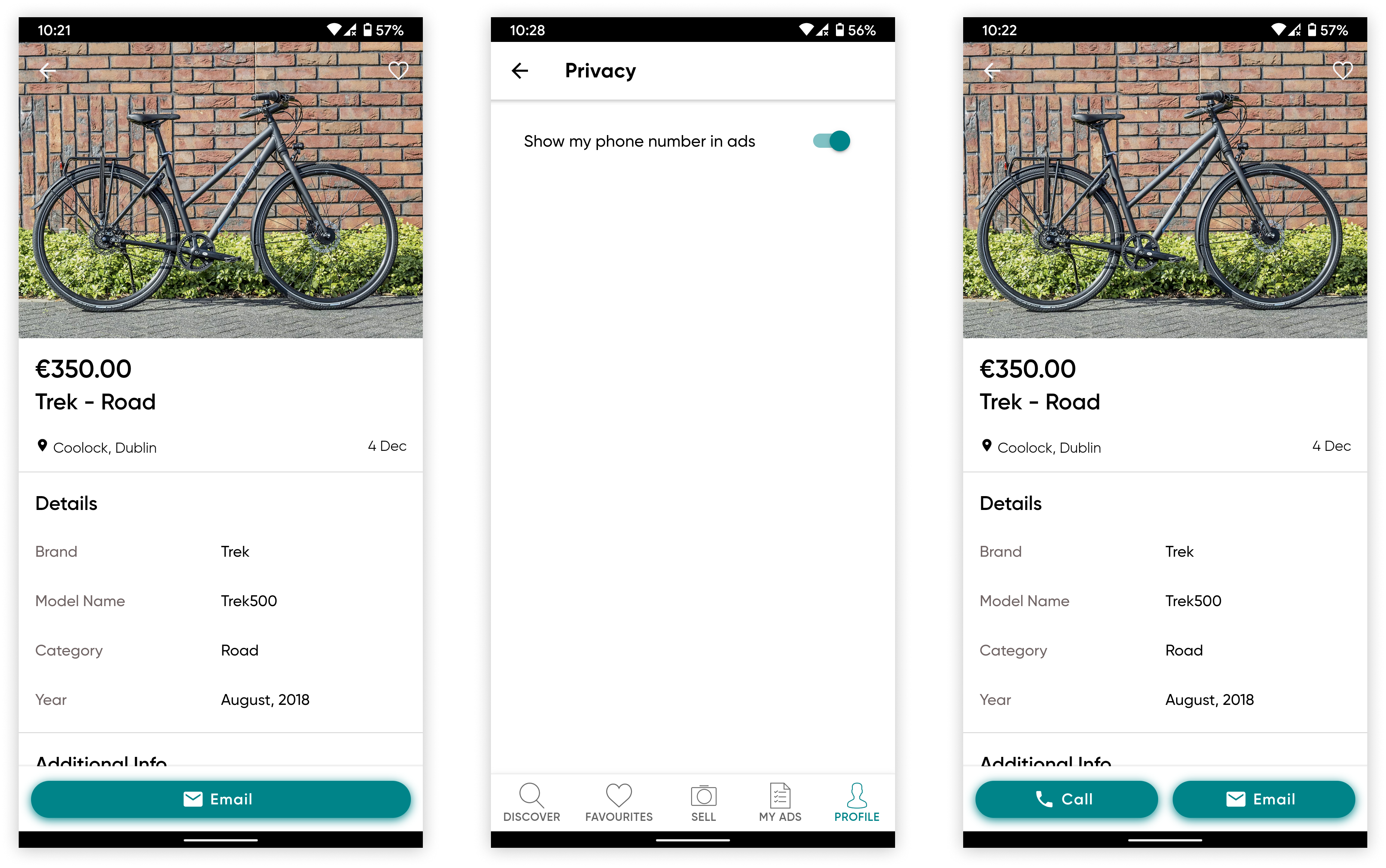
Some users preferred to show their mobile numbers to sellers to increase their chances of selling their bike quickly.
Toggle to show or hide mobile number is added in profile page under privacy option.
This solution will help Jane (the persona) to find the bike of her choice quickly and effortlessly. Jane will not have to invest time and energy walking around the streets of Dublin trying to find a bike without the assurance that she will find the exact type of bike within her budget.
Jane decided to buy a mountain bike. She gets on her phone and opens buycycle app to find a bike. She selects the search option and enters all the required filters and chooses a bike from the search results.
Jane now looks at the bike info and is interested in the bike. She calls the owner and finalises the deal. Jane is happy that she was able to find the right bike quickly and effortlessly.
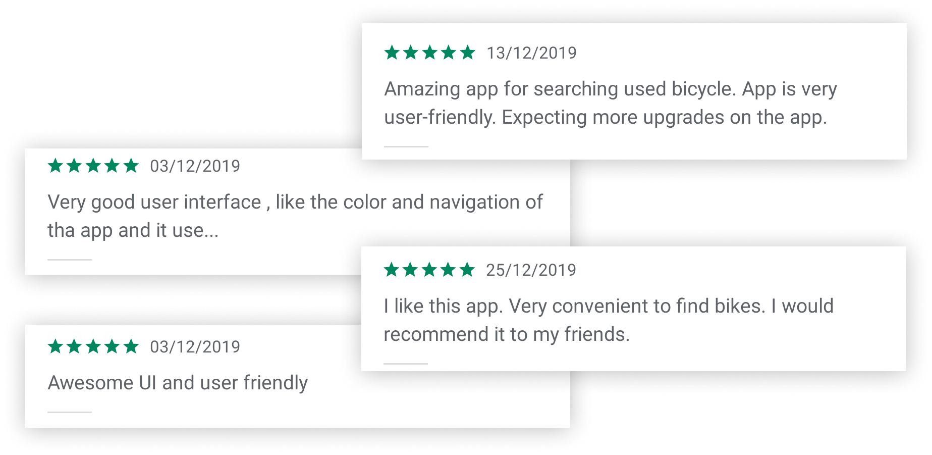
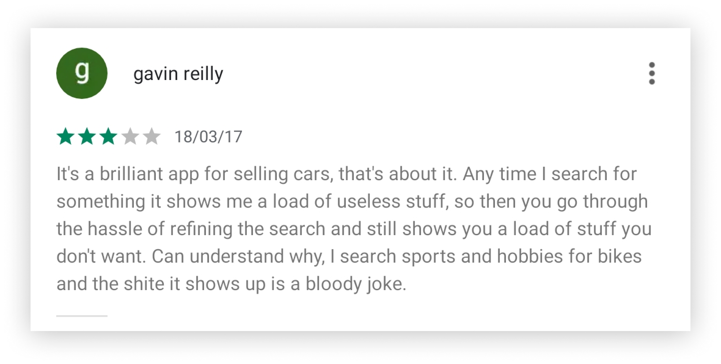
After successfully finishing the app I uploaded it to Google Play Store and below are some of the user reviews I received for the app.